Color Wheel and Basic Color Theory
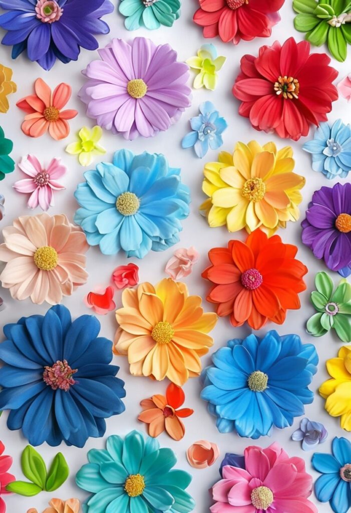
For florists aiming to create stunning flower arrangements, a firm grasp of the color wheel and basic color theory is indispensable. The color wheel, a circular diagram of colors, displays the primary colors—red, blue, and yellow—at its core. From these, secondary colors are formed: orange (red and yellow), green (blue and yellow), and purple (blue and red). Moreover, when primary and secondary colors mix, tertiary colors emerge, adding nuances and depth to floral compositions.
Moving beyond just the individual colors, the interaction and harmony among them play a vital role. Complementary color schemes, which utilize colors opposite each other on the color wheel (e.g., red and green, blue and orange), create vibrant and high-contrast arrangements. Alternatively, analogous color schemes—employing colors adjacent on the wheel, such as blue, blue-green, and green—result in more serene and cohesive designs. A triadic color scheme uses three colors evenly spaced around the wheel, offering balanced yet dynamic visuals, like a combination of red, yellow, and blue.
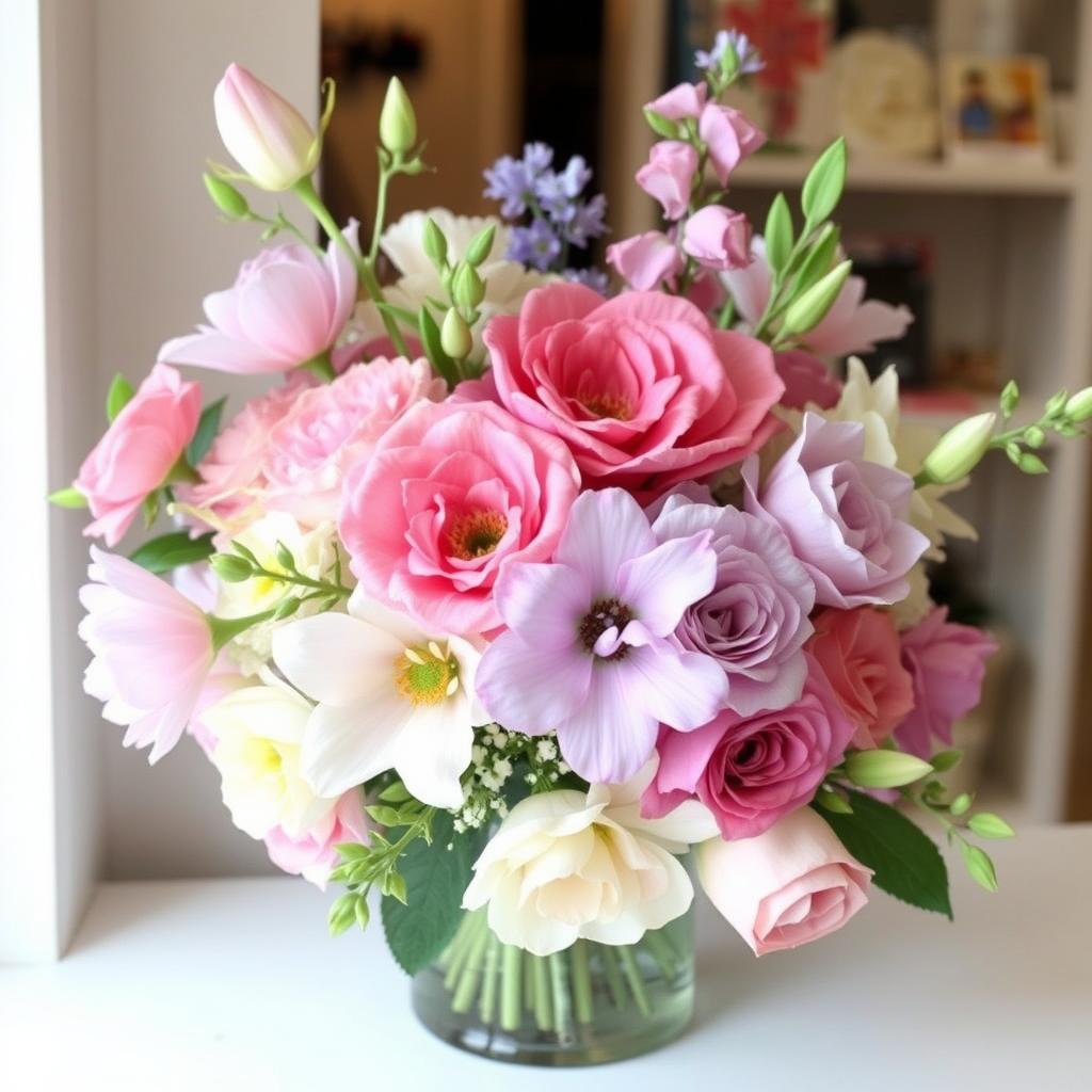
Furthermore, understanding the emotional and psychological impacts of color is crucial for florists. Warm colors like red, orange, and yellow tend to evoke feelings of warmth, passion, and energy. In contrast, cool colors such as blue, green, and purple often create a calming, tranquil atmosphere. Mastering these concepts allows florists to not only arrange visually appealing bouquets but also to evoke desired emotions through their work.
In essence, comprehending the color wheel and the basics of color theory equips florists with the tools to design balanced and striking flower arrangements. This foundation underpins the ability to harmonize colors adeptly, leading to creations that are not only visually compelling but also emotionally resonant.
Creating Seasonal and Theme-Based Arrangements
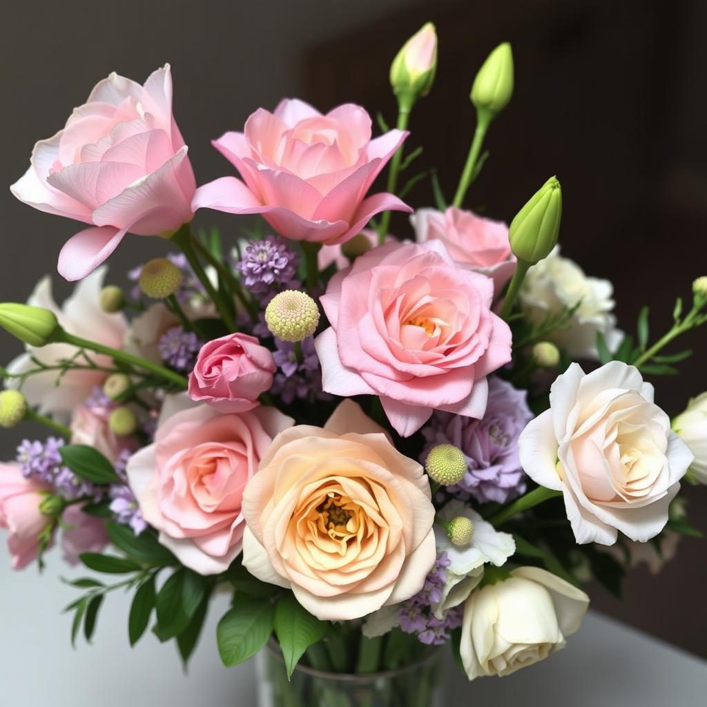
Flower arrangements are greatly influenced by the seasons, as each brings its unique palette and selection of blooms. Understanding these seasonal variations can enhance the beauty and appropriateness of floral displays. In spring, pastel colors such as soft pinks, light purples, and gentle blues dominate, reflecting the season’s renewal and growth. Blooms like tulips, daffodils, and hyacinths are popular choices. Summer, on the other hand, offers a vibrant array of bright yellows, deep reds, and oranges, indicative of its warmth and energy. Sunflowers, zinnias, and marigolds are ideal for creating lively arrangements during this period.
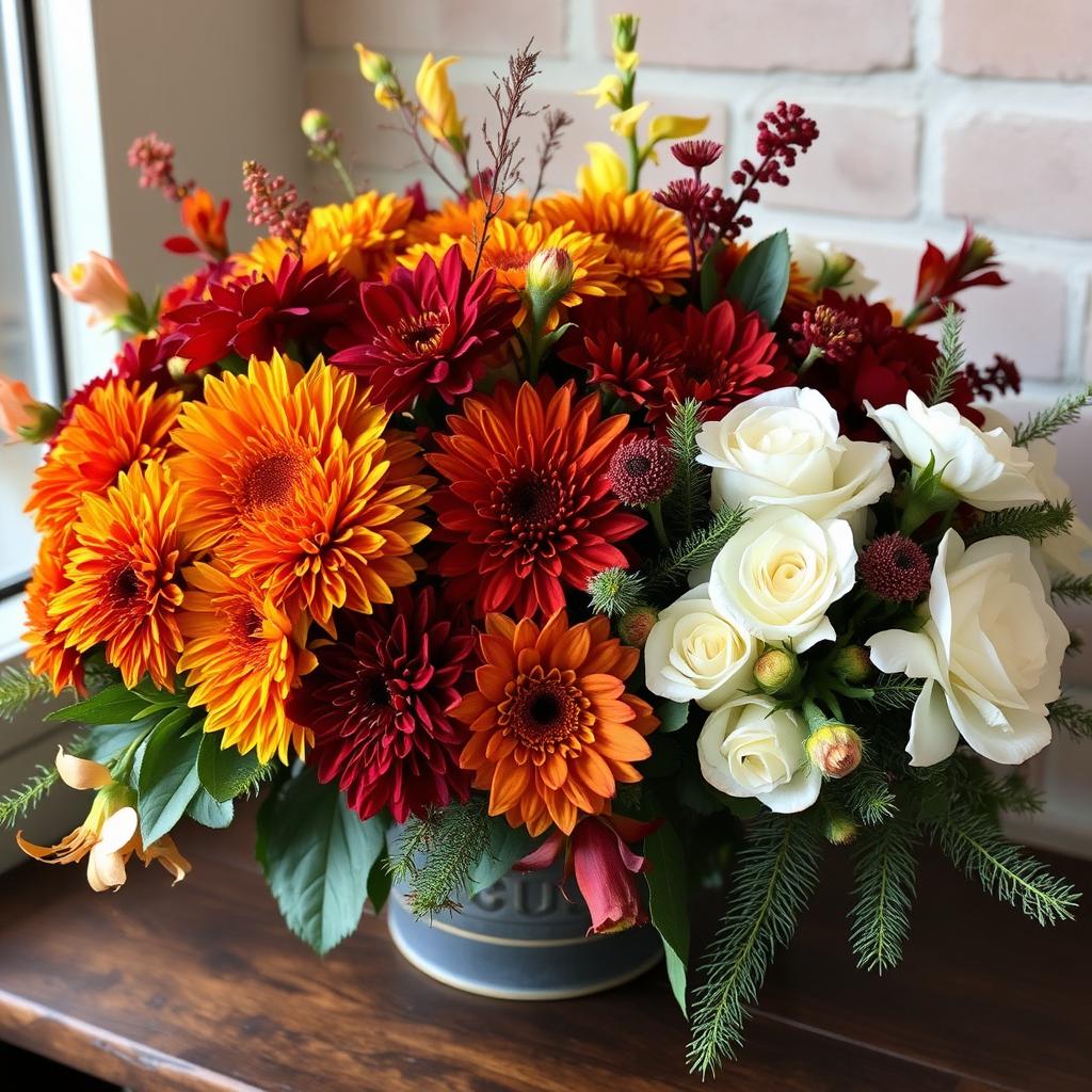
Fall introduces a rich, warm spectrum of colors, from burnt oranges to deep burgundies and golden yellows, mirroring the changing foliage. Chrysanthemums, dahlias, and asters are prominent selections. Finally, winter calls for more muted tones, with whites, icy blues, and deep greens leading the color palette. Evergreens, white roses, and poinsettias typically feature in winter arrangements, capturing the serene and reflective spirit of the season.
Themed arrangements also benefit from carefully selected colors. Wedding bouquets often feature timeless combinations such as white and pale pink for a classic elegance, or bold reds and whites for a more dramatic effect. Corporate events might prefer neutral tones with pops of corporate colors, ensuring professionalism while adding subtle vibrancy. Holiday arrangements like Christmas can embrace traditional hues of red, green, and gold, while Easter arrangements can leverage spring pastels and whites.
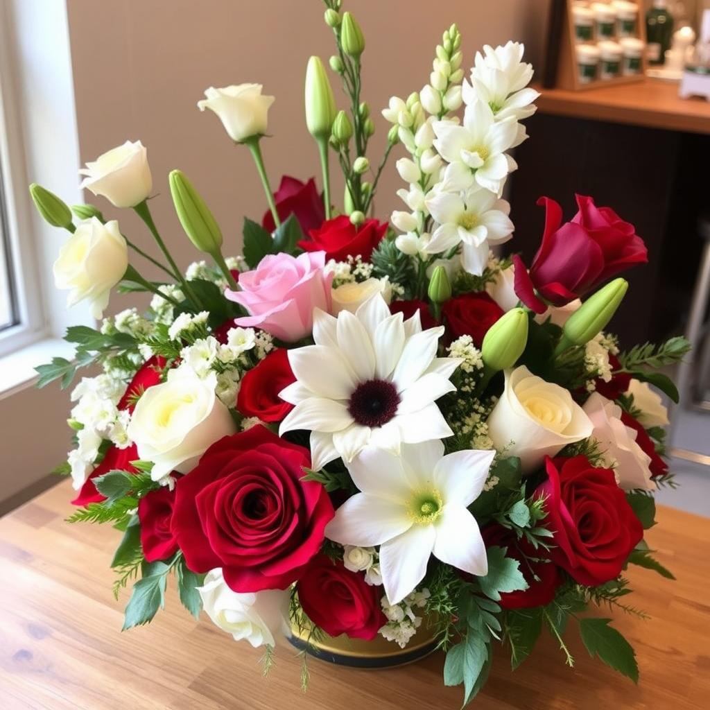
Blending traditional and modern color trends requires a keen eye. For instance, pairing classic white roses with contemporary accents like succulents or using non-traditional colors for weddings, such as navy or burgundy, can create unique and stunning arrangements. Attention to these details ensures that each arrangement is not only visually appealing but also suited to the occasion and personal preferences, making every floral display memorable and beautiful.
Balancing Bold and Subtle Shades
Creating a striking flower arrangement involves the artful balance of bold and subtle shades to achieve depth, dimension, and harmony. To master this, start by choosing focal flowers that will serve as the primary source of vibrant color. These bold shades, such as deep reds, oranges, or purples, draw initial attention and set the tone for the arrangement. When pairing these with more subtle, pastel hues like soft pinks, lavenders, and creamy whites, consider their placement to create a sense of flow and cohesion.
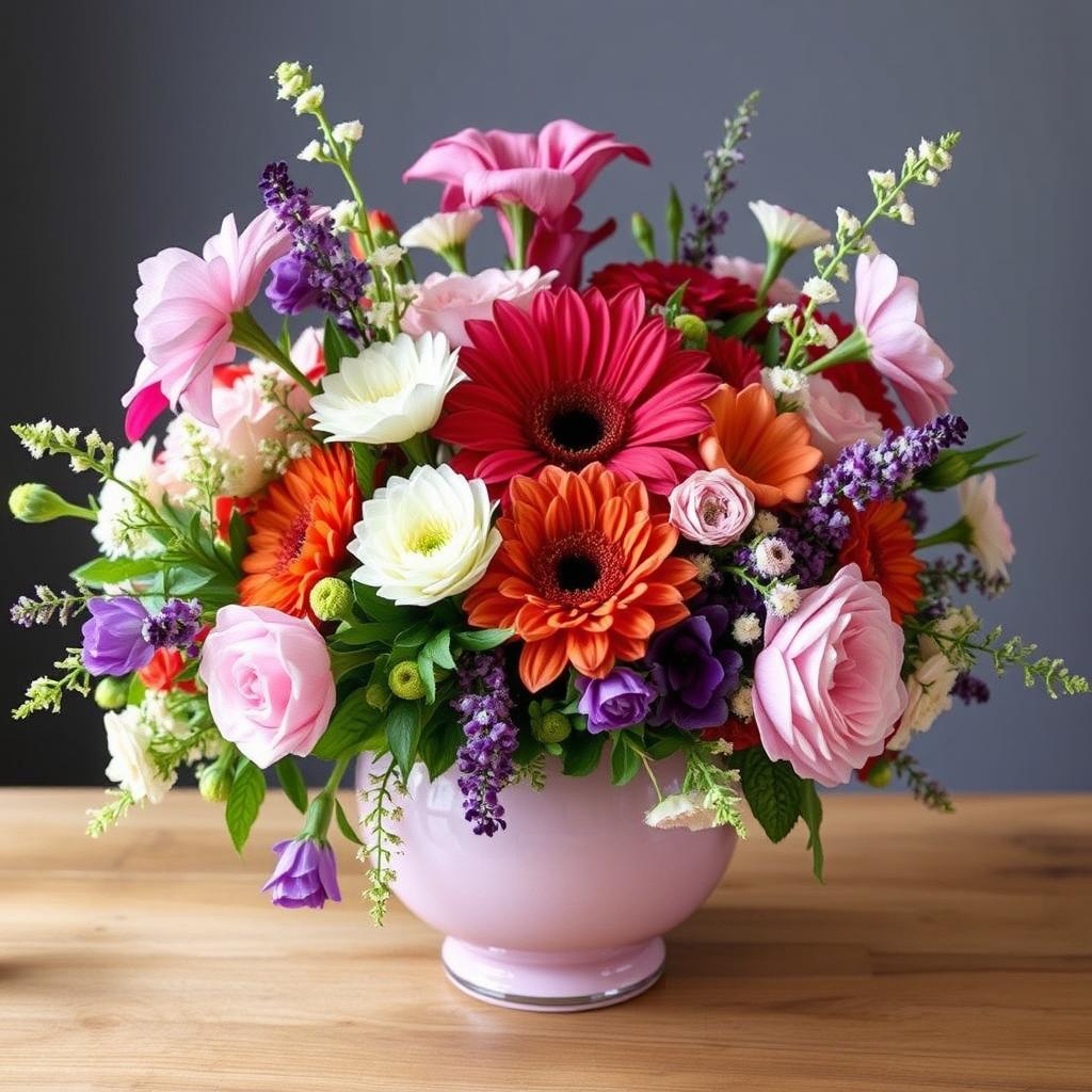
Focal flowers should ideally be positioned centrally or at prominent points within the arrangement. These are the visual anchors around which the supporting elements—such as filler flowers and greenery—can be strategically placed. Subtle shades can be interspersed around these focal points to create contrast without overwhelming the arrangement. This balancing act between bold and soft tones ensures that the vibrancy of focal flowers is accentuated, while the pastel hues provide a calming background that prevents the overall design from becoming too overpowering.

Incorporating greenery and neutral tones is another key technique for achieving a well-balanced color scheme. Greenery like ferns, eucalyptus, and ivy not only adds texture but also serves as a natural buffer that enhances the visual impact of bold colors by offering a serene backdrop. Neutral tones, such as beige or white, further stabilize the arrangement, allowing each flower’s color to complement rather than clash.
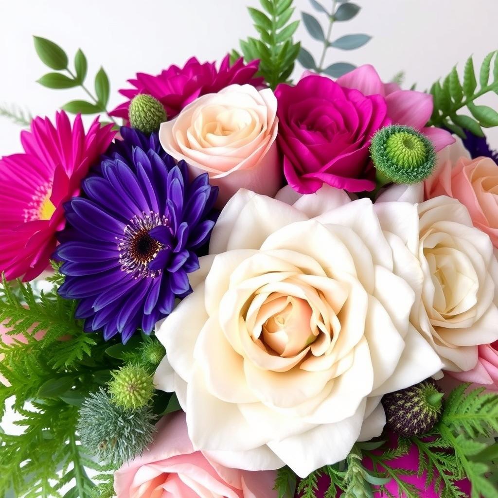
To avoid color clashes, it is essential to understand the basics of color theory. Complementary colors—those opposite each other on the color wheel—can create dynamic and visually appealing combinations. However, too many clashing shades can result in a chaotic design. Therefore, a key guideline is to stick to a unified color scheme by selecting one dominant bold color and complementing it with harmonizing pastel shades and neutral tones. This ensures each element enhances the overall aesthetic, resulting in a stunning, well-balanced floral arrangement.
Incorporating Textures and Patterns for Added Visual Interest
In the art of floral arrangement, textures and patterns play a pivotal role in elevating the appeal of your creations. When used effectively, they can complement a flower arrangement’s color palette, creating a sophisticated and multifaceted display. By integrating diverse flower shapes, sizes, and foliage types, you can add depth and interest, which captivates the viewer’s attention.
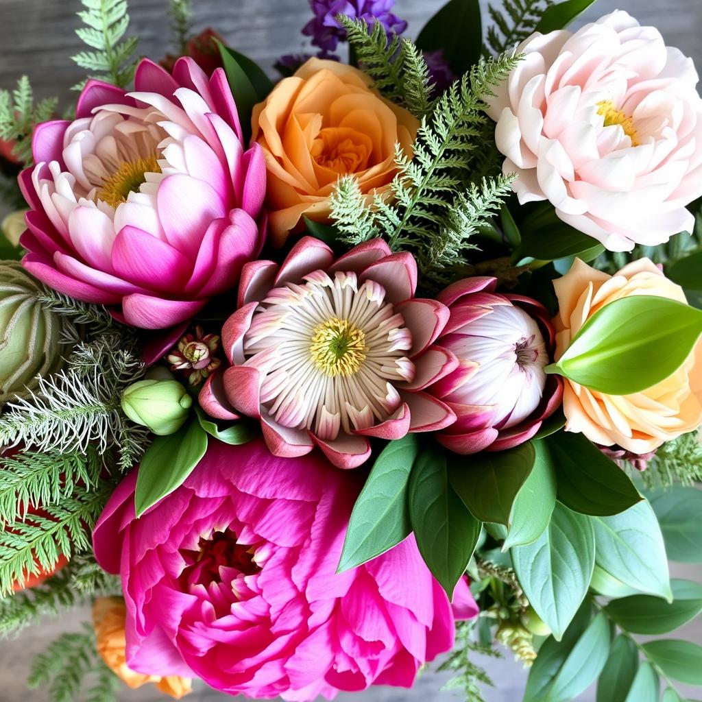
Different flower species inherently possess distinct textures. Take, for instance, the delicate and soft petals of peonies or the intricate, almost architectural structure of proteas. Pairing these textured blossoms with contrasting elements, such as the feathery foliage of asparagus fern or the bold, waxy leaves of philodendron, can result in a well-balanced and visually dynamic composition.
Furthermore, understanding how to mix and match various flower shapes and sizes is key to diversifying patterns within your arrangement. Tall and graceful flowers like delphiniums or gladioli can create vertical interest, especially when placed amidst shorter, rounded blooms such as roses or hydrangeas. Additionally, using filler flowers like baby’s breath or astilbe can provide a gentle, airy texture that softens the overall look, making it more cohesive and interlinked with the color scheme.
Different foliage can also infuse your arrangement with unique textures. Consider incorporating lamb’s ear, known for its velvety feel, or eucalyptus, which offers both a soothing scent and an interesting contrast with its silvery-green leaves. Pairing these with colorful blossoms can heighten both the visual and tactile experiences of your floral design.
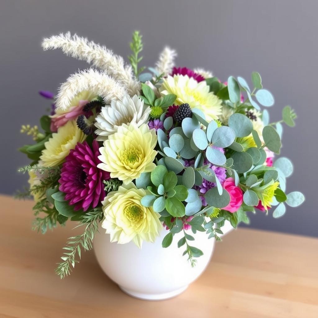
When experimenting with textures, it’s essential to keep the desired aesthetic effect in mind. A rustic, wildflower bouquet might benefit from an assortment of daisies, lavender, and queen anne’s lace, creating a natural and carefree vibe. On the other hand, a modern, minimalist arrangement might look stunning with a few calla lilies paired with sculptural foliage.
By thoughtfully incorporating a variety of textures and patterns, you can transform your flower arrangements into captivating visual masterpieces, harmoniously balancing the colors and making each element stand out. This layering of textures will not only enhance the overall appearance but also offer a rich sensory experience that delights and engages.